Level Design with an Art Perspective
Today’s devblog is with Luke Dorman, our intrepid Level Designer and Unity integration expert. Luke’s going to walk us through Ardath, a location in Broken Roads that holds a special place in our hearts. Our very own hive of scum and villainy, Ardath is where you’ll find the very best of black market goods and the (almost) worst that humanity has to offer. Collectively, the people living here can be a bit disorganised, but they know how to throw a punch, how to take one, and best of all, they brew their own beer. Cheers, Luke!
Hello, all! I’m Luke, the Level Designer of Broken Roads, and today I’ll be going over some of the things I use from an art perspective when creating and assembling levels for Broken Roads!
We’ll be looking at some of the props and objects around the Ardath Hotel. Ardath is a small settlement filled with thugs, thieves, artists, and those who were rejected from other societies. These people are bandits, pillagers, and raiders, but they feel truly free here in Ardath.
The Ardath Hotel is of course based on the real-world equivalent in the actual location of Ardath in Western Australia. The 3D model of the building was done by Bianca Roux, and the texturing was done by Sara Laubscher, both brought the building to life while giving it that Aussie post-apoc flair!
Tangents
Firstly, I’ll go over something small I keep a keen eye out for when placing objects in a scene. When two separate lines interact with each other in a way that creates an unintended relationship between them, a tangent is formed. Tangents can sometimes be hard to notice at first but most will stick out like a sore thumb if they’re not kept in check. Let’s look at some examples:
You can see here that the edge of this bookshelf is aligned with the pillar of the building. The top shelf also lines up with the top of the verandah. This makes it look a bit awkward and like it’s almost part of the hotel, so let's rotate it and change its position.
We’ve now rotated it slightly to not align with the top of the verandah, and we’ve moved it away from the pillars. We’ve also made sure the edge of the shelf doesn’t line up with the sign on the front of the verandah. Better!
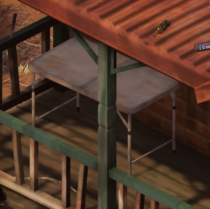
But that was a more obvious example - what about smaller tangents, like this one?
The top right corner of this table is barely aligning with the roof of the building, so we’ll make sure to move it away from the edge of the roof and rotate the table.
Now we’ve moved it to avoid the corner lining up with both the roof and the lines of the bricks behind it and made sure the legs don’t align with the pillar in the foreground. We also rotated it a bit more to break up the shapes, so let’s talk about that.
Breaking Up Shapes
In the previous screenshot, the table is surrounded by lots of straight lines and square shapes, so what I meant by “breaking up the shapes” was that we rotated the table in a way that avoided the table falling into the uniformity of those straight lines. This means the table pops out a bit more as its shape and orientation are different from the objects around it. Let's look at another example:
We have more square shapes and straight lines around here, so we avoid making more by having these ladders angled diagonally. It’s more interesting to look at and helps the ladders stand out a bit more. The camping chairs off to the side and the couch below also break up the shapes by adding curves and organic shapes to contrast against all of the hard edges in this screenshot.
Contrast
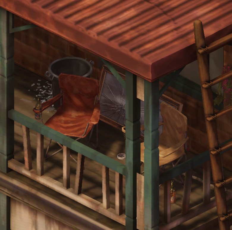
We can make certain props and objects stand out by contrasting them against other props or using certain coloured props. Let’s go back to those camping chairs from before:
The bin and the mirror behind these chairs allow them to stand out against the orange bricks of the building. Without them, the chairs blend in a bit too much.
We can also use props of certain colours that inherently contrast against their backdrop. Here are some more camping chairs, this time in blue and green against a red roof.
We could of course use green and blue camping chairs instead of having to put a mirror and a bin behind the red and tan ones, but variety is the spice of life, and it lets us have some fun with environmental storytelling. Speaking of which…
Environmental Storytelling
Why is there a bin and a mirror there? Why are there chairs and beers on the roof? Was that a knife in the railing just before? These are all little details to give us some insight into how the people of Ardath like to live - carefree and dangerously. We previously saw ladders leading up to the roof, which is presumably how the chairs and beers got up there. Must be a nice view, but…
Accidents can happen. The empty beers might not be accidental though, they are an untidy bunch, judging by the smashed mirror and the dirty couch lying around.
When they do try to be clean, however, they make it fun. Unless you’re not fun and think climbing up a telephone pole just to hang some washing is “a hazard” or whatever.
That about wraps up what I wanted to show off in this blog post! Creating levels is a collaborative effort. Sara Laubscher lead the environment design and texture work, Bianca Roux modelled the 3D props of the level and Ryan Gee handled the scene lighting and vegetation, without them none of the locations in Broken Roads would be what they are. I’ve learned a lot working with the art team of Drop Bear Bytes, and I’m excited to see what more we can do and how far we can push the visuals of our levels!
Thanks so much for reading, we will see you again soon!


